Kaushan Script
TrueTypeFreeware
- Acentos (parcial)
- Acentos (completo)
- Euro
KaushanScript-Regular.ttf
Tags
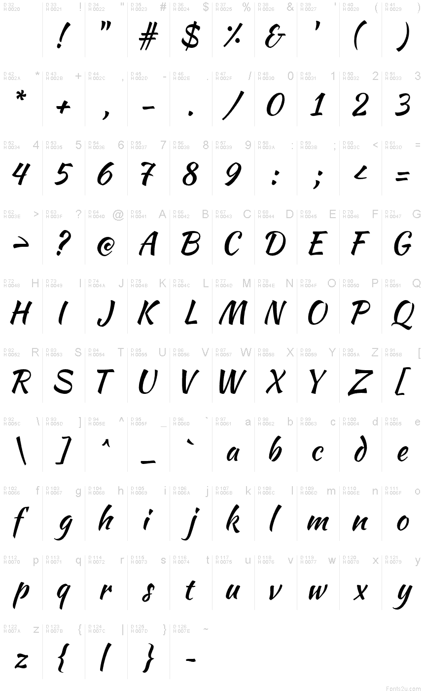
Mapa de caracteres
Porfavor use o menu suspenso para ver os diferentes mapas de caracteres contidos nesta fonte.

Informaçőes de fontes básicas
Nota de direitos autorais
Copyright (c) 2011, Pablo Impallari (www.impallari.com|impallari@gmail.com),
Copyright (c) 2011, Igino Marini. (www.ikern.com|mail@iginomarini.com),
with Reserved Font Name Kaushan Script.
Copyright (c) 2011, Igino Marini. (www.ikern.com|mail@iginomarini.com),
with Reserved Font Name Kaushan Script.
Família da fonte
Kaushan Script
Subfamília da fonte
Regular
Identificação única da subfamília
PabloImpallari: Kaushan Script: 2011
Nome completo da fonte
Kaushan Script
Versão da tabela de nomes
Version 1.002
Nome da fonte do postscript
KaushanScript-Regular
Nota da marca registrada
Kaushan Script is a trademark of Pablo Impallari.
Nome do fabricante
Designer
Descriçăo
Kaushan Script feels like writing quickly with an inked brush.
When making digital typefaces, the more you refine the shapes of the letters, the more energy you take away from them. Because of that, Kaushan is unrefined - and carries a lot of energy.
By avoiding typographical perfection, it stays more natural. The angles of the vertical strokes vary a little, and the positioning along the baseline jumps around, giving it a more rustic and natural feeling.
Most script fonts have long ascenders and descenders, and this means they look too small when used at normal sizes on the web. This font it's optimized in the technical details to be very readable as a web font, even when used as small as at 16 pixels.
It was funded by people like you, via Kickstarter.
Special thanks to the project backers! They are all listed on the website: http://www.impallari.com/kaushan
Informações da fonte estendida
Plataformas suportadas
PlataformaCodificaçăo
UnicodeUnicode 2.0 e semântica em diante, Unicode BMP só.
MacintoshRomano
MicrosoftUnicode BMP só
Detalhes da fonte
Criado2012-01-21
Revisăo1
Contagem de glifos394
Unidades por Em1000
Direitos de IncorporaçăoIncorporação para instalação permanente
Classe da famíliaScripts
PesoMédio (normal)
AmplitudeMédio (normal)
Estilo para MacNegrito
EndereçoApenas glifos fortemente da esqueda para a direita + neutros
Padrăo naturalItálico
AfastamentoNăo monoespaçado