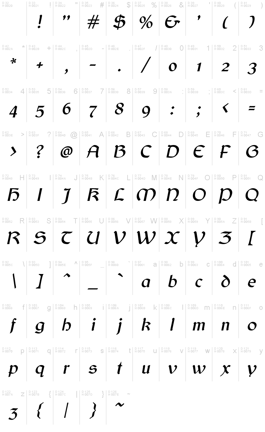
Balgruf Italic
OpenTypeGNU/GPL
- Acentos (parcial)
- Acentos (completo)
- Euro
Balgruf_Italic.otf
Tags
Nota do autor
Behold the captivating Balgruf Italic font! Designed by the talented Paul Miller, this gothic typeface boasts a Celtic-style flair that is sure to add an enchanting touch to any project. With its semi-light weight, Balgruf Italic is perfect for creating striking headlines and titles, while maintaining legibility. This versatile font is suitable for a range of projects, from fantasy and historical novels to video games and movie posters. Let your creativity run wild with Balgruf Italic – make your designs stand out with this unique and alluring font!
This is a font inspired by the game 'Skyrim', if you have ever played Skyrim and read any of the books there you may have noticed that the upper case 'F' looks out of place and has a very large right side bearing. It looks like a graphic designer with no typographical experience was given the job of making an F on a very tight deadline and this is what he/she came up with. It seems to be cobbled together from pieces of other characters in the font cut up and glued together.
Once you see this mistake you cannot unsee it. As a type designer I thought I could have done better. So the question arose, how would I have done it. This font is the answer to that question.
Enjoy!
Mapa de caracteres
Porfavor use o menu suspenso para ver os diferentes mapas de caracteres contidos nesta fonte.

Informaçőes de fontes básicas
Nota de direitos autorais
Copyright (c) Paul James Miller, 2020. All rights reserved.
Família da fonte
Balgruf
Subfamília da fonte
Italic
Identificação única da subfamília
Balgruf Italic:Version 1.201
Nome completo da fonte
Balgruf Italic
Versão da tabela de nomes
Version 1.201;March 28, 2021;FontCreator 13.0.0.2683 64-bit
Nome da fonte do postscript
Balgruf-Italic
Nome do fabricante
Designer
Descriçăo
As a typographer playing Skyrim by Bethesda I was annoyed by the font used in the books. The upper case 'F' seemed to have been cobbled together from other bits of the font and didn't fit with the aesthetic of the rest of the letters in the font, it also had a right side bearing which was much too large.
As if it had been hastily made by a graphic designer with no experience in typography who was on a strict deadline.
Once you 'see' this mistake you cannot unsee it and it was annoying.
So the question arose, how would I have done it?
This font is the answer to that question.
Enjoy !
As if it had been hastily made by a graphic designer with no experience in typography who was on a strict deadline.
Once you 'see' this mistake you cannot unsee it and it was annoying.
So the question arose, how would I have done it?
This font is the answer to that question.
Enjoy !
Informações da fonte estendida
Plataformas suportadas
PlataformaCodificaçăo
UnicodeUnicode 2.0 e semântica em diante, Unicode BMP só.
MacintoshRomano
MicrosoftUnicode BMP só
Detalhes da fonte
Criado2020-10-23
Revisăo1
Contagem de glifos445
Unidades por Em2048
Direitos de IncorporaçăoIncorporação para instalação permanente
Classe da famíliaSem classificaçăo
PesoMédio-leve
AmplitudeMédio (normal)
Estilo para MacSublinhado
EndereçoApenas glifos fortemente da esqueda para a direita + neutros
Padrăo naturalItálico
AfastamentoNăo monoespaçado
Pacote completo contém 2 cargas de fonte listadas abaixo:
Balgruf_Italic.otf
Balgruf.otf
Balgruf.otf
Balgruf
OpenTypeGNU/GPL